


Finally!!! Is how I'm feeling right now. I think it's been easily two months since the US nail addicts out there have been able to enjoy this Collection. After months of going every week to visit Planet Parfum who carries OPI here in Belgium, it's finally...FINALLY released!!! Couldn't be happier. So I've only picked up 4 colours of the Collection (because mucho dinero!) but I'm very happy with my selection, very autumnal, if I do say so myself (except for Purple Palazzo Pants...obviously)!

OPI - Tiramisu for Two (Venice Collection - Autumn 2015)
Now although I'm not a particular fan of the dessert (don't like coffee) this colour is divine! I would definitely describe it as a light pinky-toned latte coloured creme (staying with the coffee theme here). It's right on the line between a light beige and a light dusky pink...gorgeous!
The Collection came out with 3 neutrals: Be There in a Prosecco, I Cannoli Wear OPI and this one. Since I already own My Vampire Is Buff, I really did not feel the need to buy Be There in a Prosecco; they are pretty much identical colours. And since I'm not a big fan of white on my nails, as you will know from my Top 5 Summer Nail Polishes post, I Cannoli Wear OPI didn't tempt me either; it pulls way too white for me, even though most would describe it as a very light grey. Furthermore, I was really hoping for Tiramisu for Two to be a dupe of Barry M's Gelly Hi-Shine in Lychee, which although way cheaper takes forever to dry and I always get, without fail, smudge marks on my nails. Although slightly pinker, Tiramisu for Two fits the bill (for comparison swatches, go to the bottom of this post)!
APPLICATION
- 3 coats (no base because swatch), could get away with 2 if you want a less gel-like finish, but opacity is pretty much perfect at 2 coats (small streaks but not that noticeable).
Formula is quite thin on application, so it has a tendency to pool in the cuticle region, but it evens itself out upon drying and leaves no visible pool line (dries quickly). The thinness of the formula also means it's quite streaky on the 1st coat, but it's very opaque, so it's not that awful combo of sheerness & streakiness that needs infinite coats of nail polish. Again, you could get away with just 2 coats if you don't mind barely noticeable streaking. But it gets its lovely shiny, almost gel-like, finish at 3 coats.

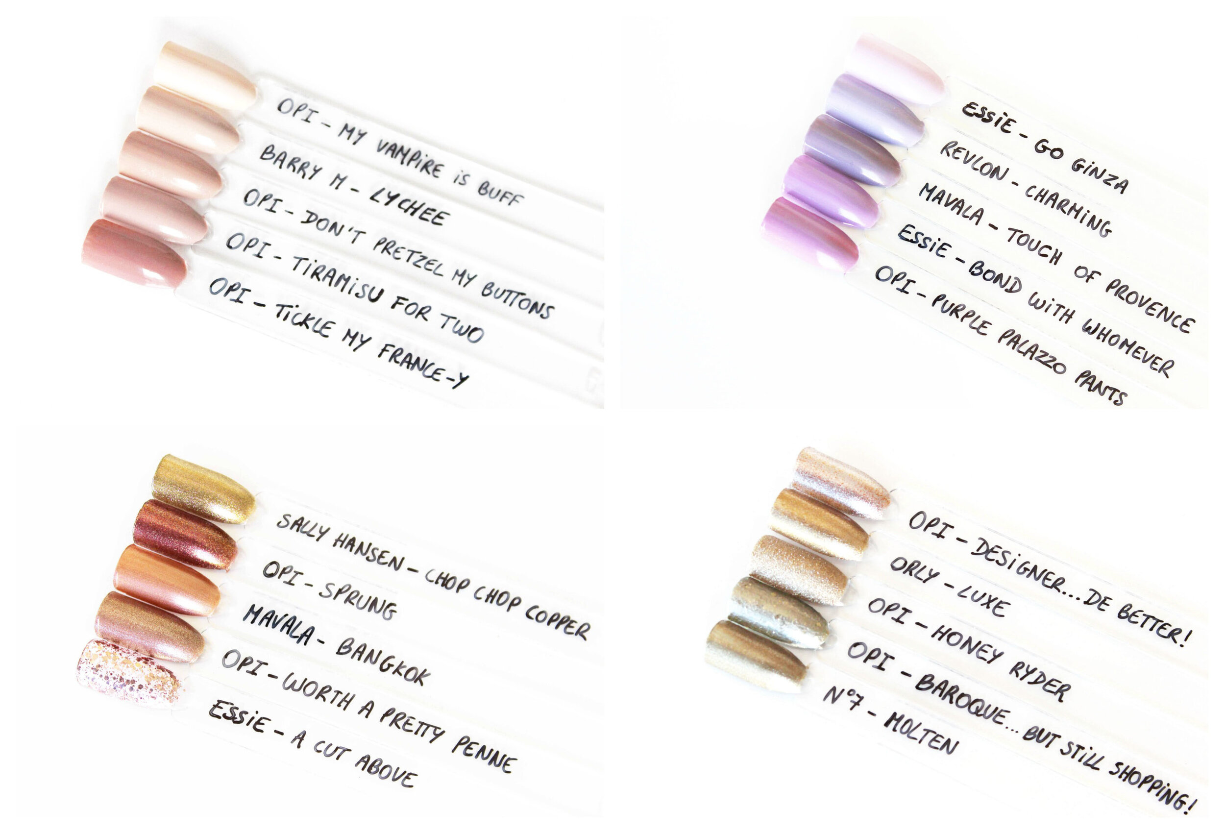
OPI - Purple Palazzo Pants (Venice Collection - Autumn 2015)
This is a beautiful lilac colour. I was very reluctant to purchase this one though, not because it's not very autumnal, but because looking at other peoples' swatches I thought that it would look too similar to a polish I already own...Essie's Bond With Whomever (comparison swatches below). And indeed they are very similar (think Essie Mint Candy Apple and Blossom Dandy similar), however Purple Palazzo Pants pulls a bit pinker and warmer than Bond With Whomever (more blue-toned), so if you are a fan of lilac on your nails then I would say get this one, but if you already own Bond With Whomever then I think you can afford to skip it.
APPLICATION
- 3 coats (no base because swatch) this has the same application as Tiramisu for Two but maybe a bit streakier and a tiny bit less thin, you couldn't really get away with 2 coats for this one though (visible streaking). It also has the same pooling effect as Tiramisu for Two which disappears when dry. Lovely shiny gel-like finish.

OPI - Worth a Pretty Penne (Venice Collection - Autumn 2015)
Some have described this polish as a coppery foil, but I find the colour to be way more rose gold. I think the silver micro-shimmer pulls what could have been a very coppery polish to a more neutral "delicate" colour with a pop of je ne sais quoi! This colour was definitely the one I was looking forward to the most from the Collection (along with Baroque...But Still Shopping!) and far from being disappointed (which is usually the case when you have such high expectations) I was pleasantly surprised! I would describe Worth a Pretty Penne as Designer...De Better's ginger little sister (for comparisons, go to bottom of this post), I love it!
If you buy one colour from this Collection make it this one, you won't be disappointed! Plus, unlike some from this Collection (cough cough...Gelato on My Mind and Purple Palazzo Pants, cough cough), it is a conventional Autumn colour (from the rust category).
APPLICATION
- 2 coats (no base), it could be a one coater if you don't mind a lighter colour and seeing a bit of the nail line. At 2 coats it reaches full opacity (the extra coat doesn't deepen the colour by much).
This one also has a thin formula (something I notice quite often with OPI polishes compared to Essie ones) but not as liquid-y as the cremes above, but I think that's because it's more of a metallic - so an easier formula to manipulate and hence no pooling.
It has a slight dull finish, but the metallic shine gives it all the glamour it needs. The metallic component of this polish also means that it gets some brush stroke marks. This could be avoided by sponging on the last layer; however, I personally find it so minimal I really wouldn't find it necessary. Plus, the brush stroke marks make the polish look more like penne rigate! Don't think it was intentional though, but it's a nice touch.

OPI - Baroque...But Still Shopping! (Venice Collection - Autumn 2015)
This one was the most interesting of the bunch for me, a lot of people described this one as ugly (I don't think any polish can beat Essie's Belugaria in that domain). But this polish texture is exactly what I picture Baroque art and Venetians' luxurious costumes to be like in nail polish format. I just wish that the colour had been a bit more of a yellow gold (reminiscent of gold leaf which was a big thing in Baroque art) rather than the very green tinged silver-gold this is. However, I've seen about three more polishes of this texture in the upcoming OPI Starlight Collection which I have no intention of buying because they are all too silver, and I think once you have one, you have them all.
APPLICATION
- 3.5 coats (no base), you could get away with 2 coats (the metallic base covers completely in two) but there isn't much glitter at two coats as it's very difficult to get on the nail.
It really is a Catch 22 when it comes to the glitter because if you want more on your nails then you have to add a layer, but as you do so, the metallic base covers the previous layer's visible glitter. This is the effect that reminds me of the gold leaf texture, which is perfect when it comes to Baroque, but is very annoying if you just want more glitter. Not to mention the glitter unfortunately sticks to the side of the bottle hence you get false expectations as to the amount of glitter you'll get on your nails.
Furthermore, because it has a metallic base you also get the inconvenience that that generates...brush stroke marks. These brush stroke marks unlike for Worth a Pretty Penne are difficult to deal with especially when you're also trying to get the glitter "evenly" distributed on the nail. Contrary to most glitters you can't just fish and dab them on as it leaves very odd brush marks in the metallic base.
So I've described how difficult this formula is to work with so here is the technique I use to get the results you see in the pictures:
1st coat: Get the base on and don't worry about the glitter yet
2nd coat: Deepen the base and start getting bigger chunks of glitter on the nail by fanning out the brush (pressing on the brush a bit harder than you normally would) to "scrape" the glitter off the brush whilst still getting straight brush stroke marks
Repeat step 2 until satisfied with glitter deposit, be careful each new layer covers previous layer's glitter hence my 3.5 coats since the 0.5 was where I adjusted a bit to get a more even glitter distribution.
Now for the positive aspects of this polish:
It's a fast dryer (as it's a metallic) and it's one of the easiest glitters I've ever had to remove. No soaking required, just put remover on tissue or cotton pad leave on nail for 20 seconds them rub off and repeat once. Remove last bits and edges with an ear bud soaked in remover. This polish, unlike many glitters I've encountered (cough cough...Essie's Luxeffects...cough cough), doesn't scratch and damage the surface of the nail when removing. I think this has a lot to do with the metallic base the glitter is submerged in, which acts as a buffer between the scratchy glitter and your nail. So great removal although not as easy as a creme, it's still a glitter after all.
So as the name would suggest this really is a high maintenance polish to apply, but I think it's definitely worth it! But it's up to you whether you think this colour and texture is worth the effort. Plus, if you are waiting for an alternative from the OPI Starlight Collection, now you'll know how to apply it ;)
So there you have it, my selection from the OPI Venice Collection, long time coming "n'est ce pas"!
Have you picked up any polishes from this Collection? If so, which ones?
What do you think of this new texture/formula that is the Baroque...But Still Shopping! nail polish and OPI's new obsession with it?
If you're not a nail polish addict, have you ever been to Venice and what did you most enjoy from your trip?
xxxemma